I have spent enough time comparing wedding inspiration boards to know that a beautiful celebration does not require a luxury budget. These affordable wedding palettes use smart color combinations, simple textures, and thoughtful accents to create a polished look without unnecessary spending.
Ivory and Champagne Minimalist Wedding Palette
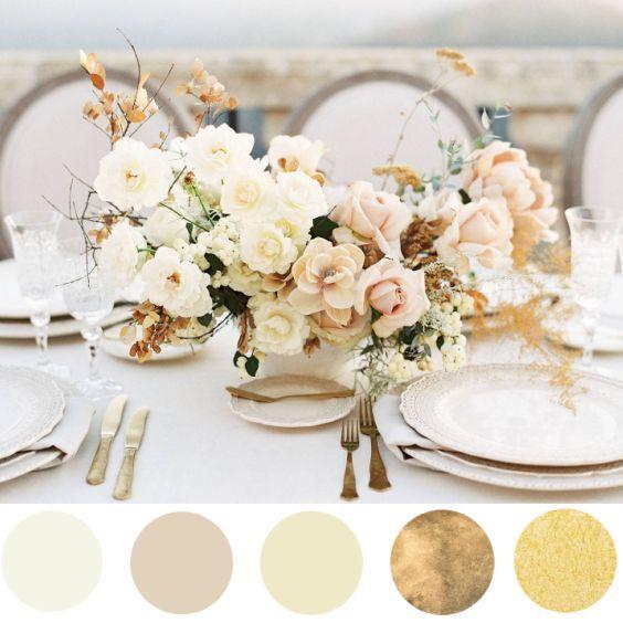
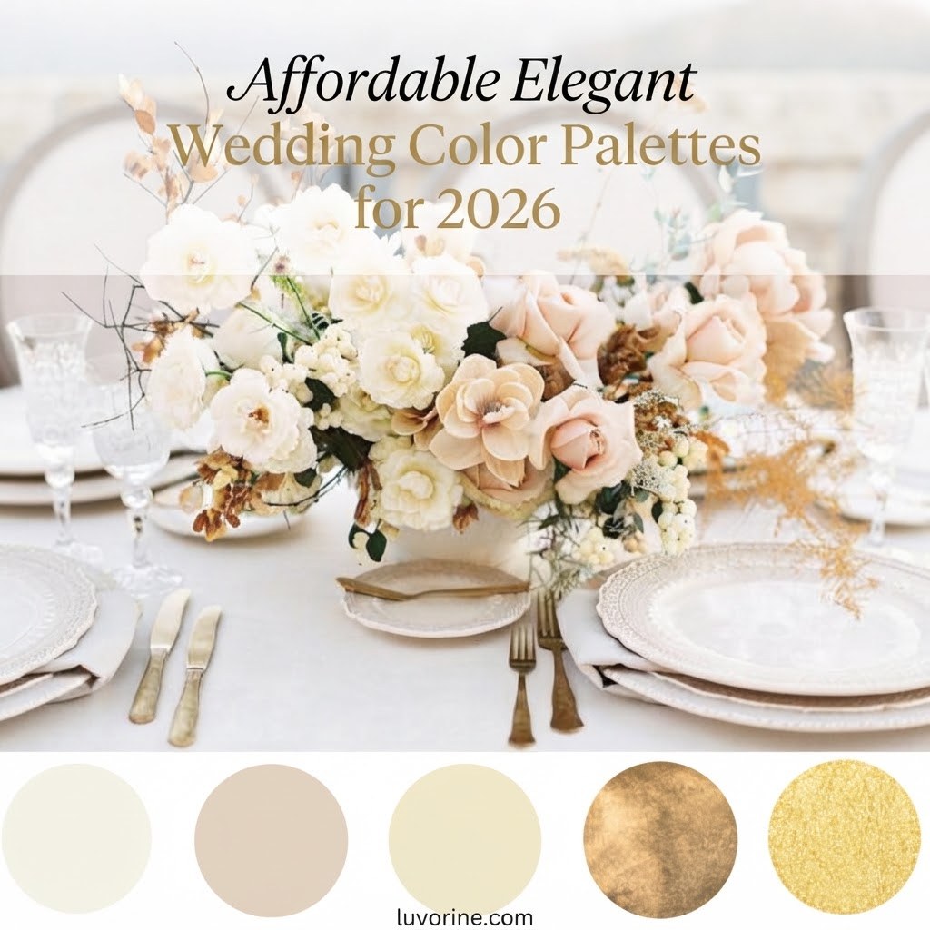
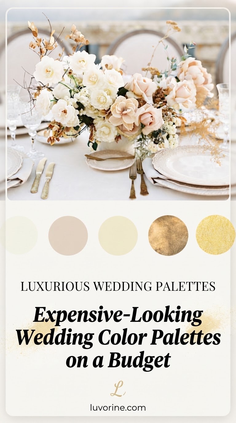
I love ivory and champagne for couples who want elegance without filling every corner with decor. The neutral color pairing works beautifully with candles, simple florals, and affordable linen details.
Palette summary
- Ivory creates a clean foundation.
- Champagne adds warmth and a subtle luxury feel.
My budget trick is using fewer statement pieces and letting texture do the work. Satin ribbons, glass candle holders, and greenery can make this palette feel expensive while staying practical.
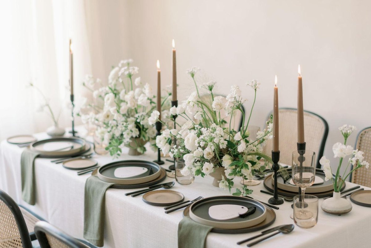
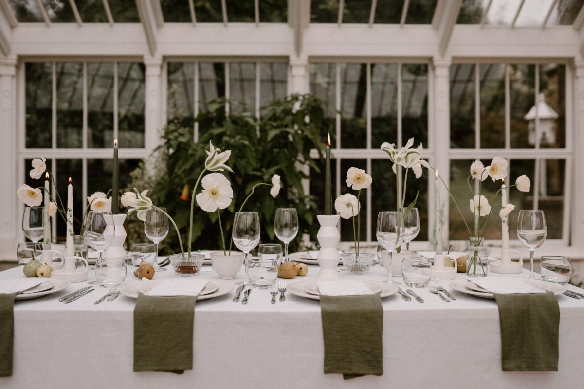
Sage Green and Soft White Garden Wedding Palette
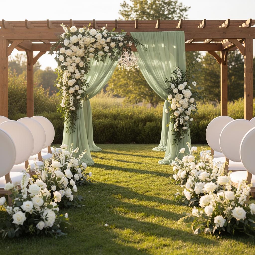
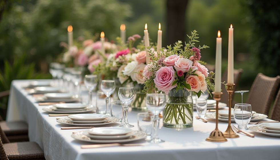
Sage green remains one of my favorite choices for an elegant outdoor wedding because it blends naturally with foliage. The garden-inspired palette feels relaxed, timeless, and easy to build with affordable greenery.
- Flowers: Use eucalyptus, white blooms, and seasonal stems.
- Decor: Add wood, glass, or linen textures.
I would choose this combination when the venue already has natural beauty. It lets the surroundings become part of the design instead of forcing you to decorate every surface.
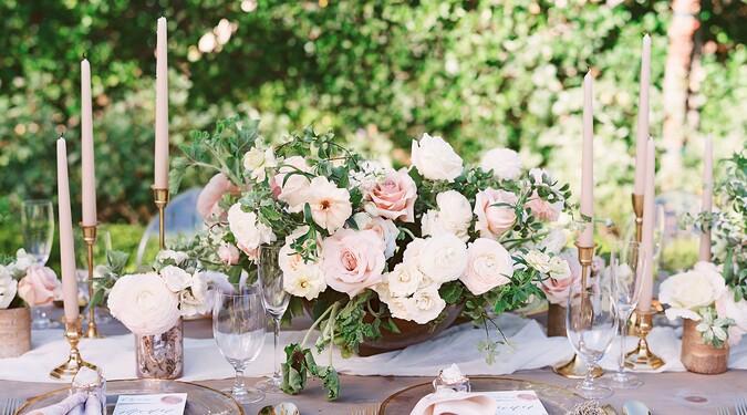
Dusty Rose and Blush Romantic Wedding Palette
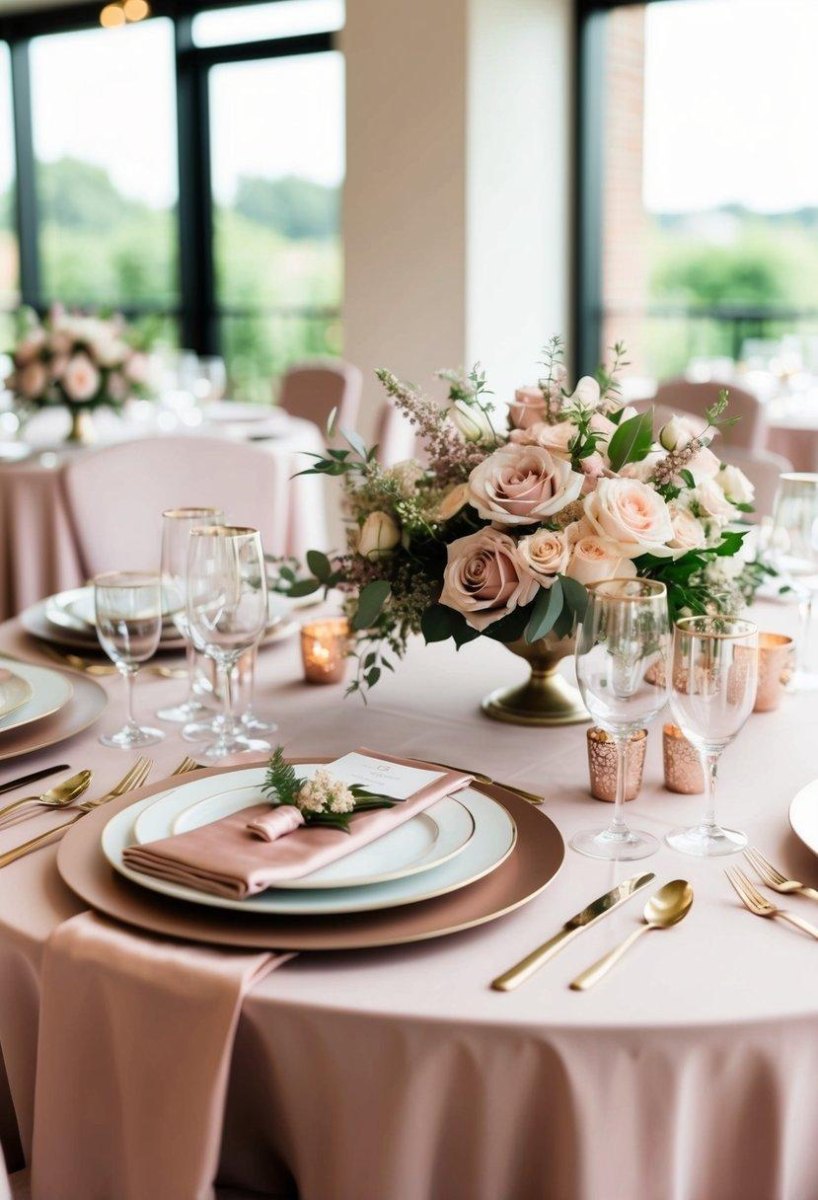
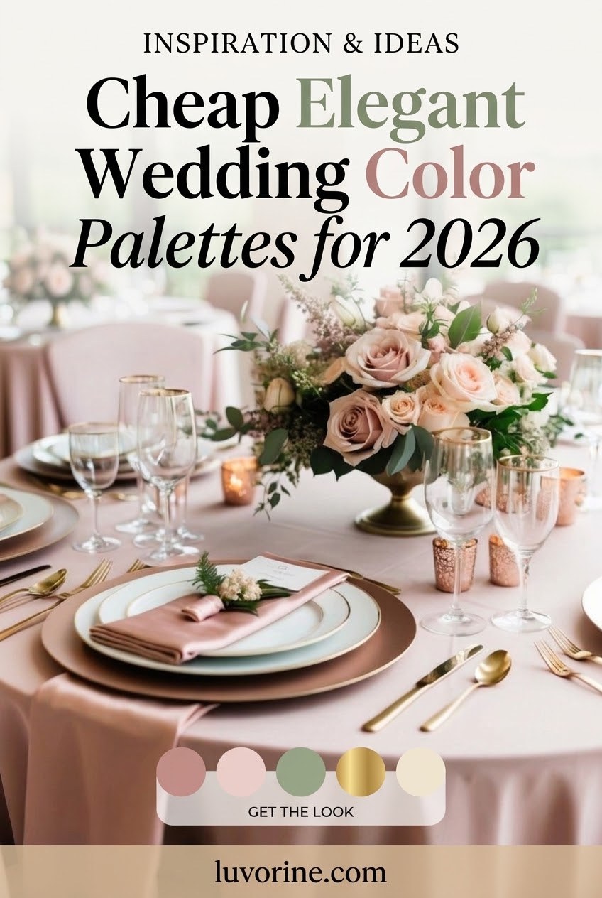
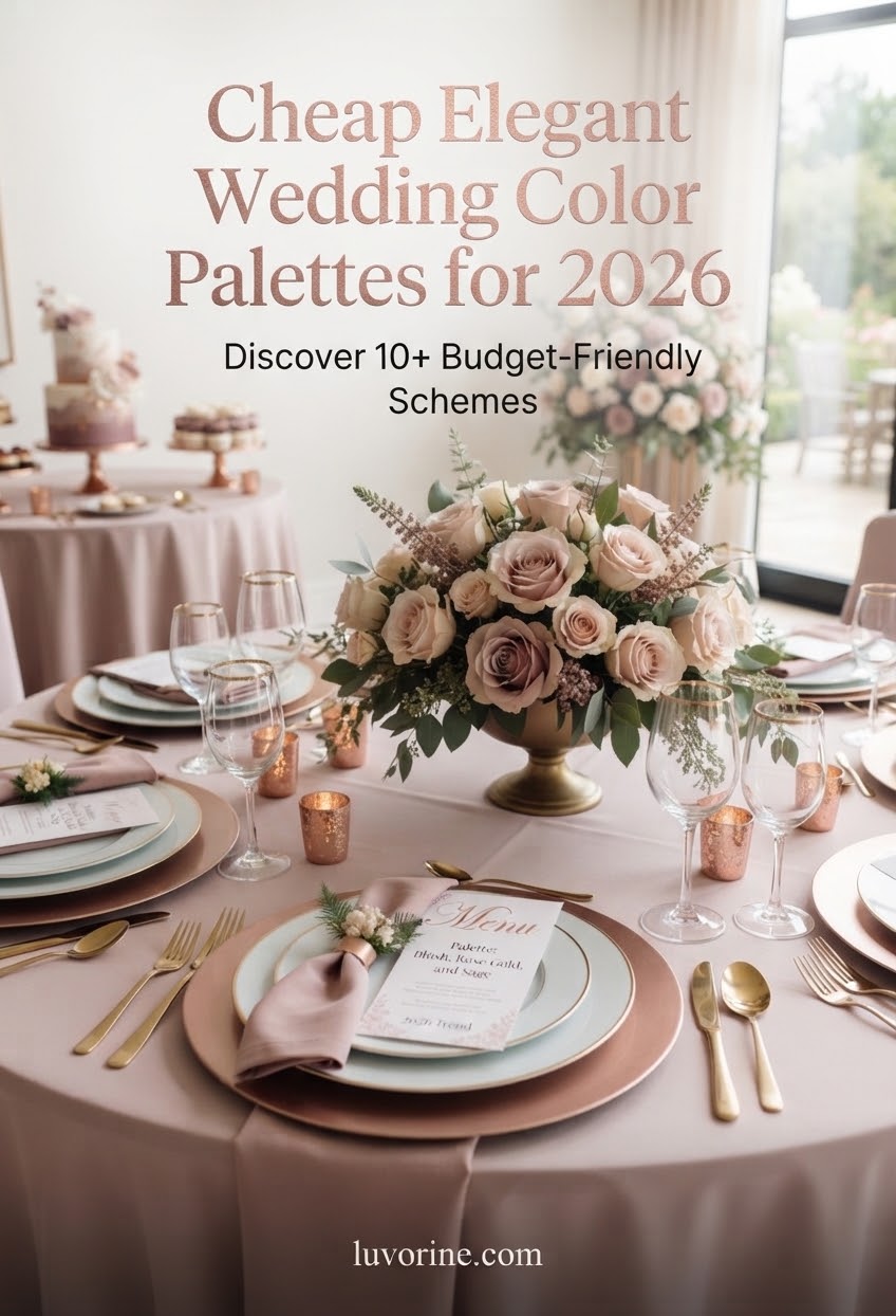
Dusty rose and blush are ideal when you want romance without a sugary pink look. I like the muted pink combination because it photographs softly and pairs well with cream, greenery, and simple metallic accents.
- Choose seasonal flowers to control costs.
- Mix blush textiles with neutral table pieces.
- Use dusty rose for accents rather than every detail.
The mistake I see most often is buying too many matching items. A few carefully placed dusty rose details usually create more impact than a room full of identical decorations.
Navy Blue and Gold Classic Wedding Palette
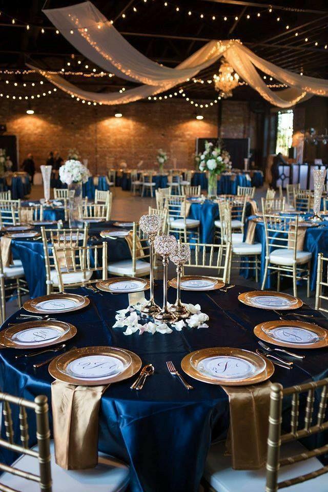
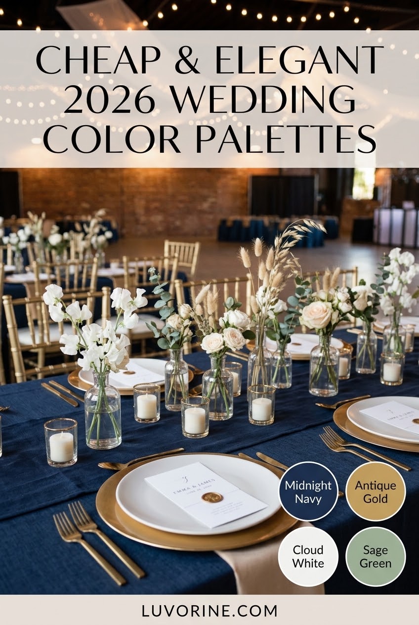
Navy blue and gold is a reliable choice when a couple wants a formal feel without chasing short-lived trends. The classic contrast gives invitations, attire, and table settings a coordinated appearance.
| Color | Budget use |
|---|---|
| Navy | Table runners, suits, stationery |
| Gold | Small accents and candle details |
I prefer using gold sparingly because too much metallic decor can quickly raise costs. A few gold touches usually look more intentional and photograph better.
Terracotta and Cream Boho Wedding Palette
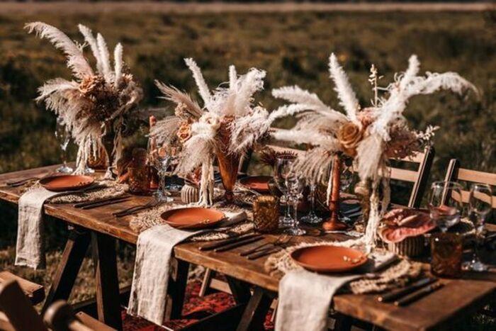
Terracotta and cream are perfect for couples who like warm, earthy celebrations. This boho wedding palette works especially well with dried flowers, natural fabrics, and handmade-looking details.
Why it works
- Warm colors feel welcoming.
- Natural textures are often budget-friendly.
Watch for
- Too many orange tones can overwhelm.
- Some dried florals require careful sourcing.
I would pair terracotta with cream instead of adding too many extra colors. The simplicity is what makes this look feel collected rather than cluttered.
Lavender and Gray Elegant Wedding Palette
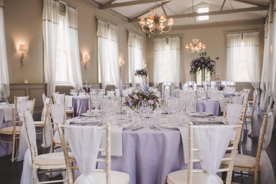
Lavender and gray gives a wedding a gentle, slightly vintage personality. I like this soft elegant palette for couples who want color but do not want anything too bright.
- Balance. Pair lavender with gray neutrals to keep the look refined.
- Accent. Add silver, greenery, or ivory details.
This palette can also help stretch a budget because gray basics are easy to reuse across linens, signage, and accessories.
Black and White Modern Budget Wedding Palette
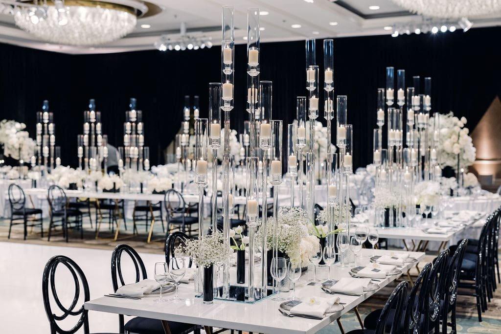
Black and white is the palette I recommend when the goal is maximum impact with fewer purchases. The modern monochrome style relies on contrast, which means simple pieces can still look deliberate.
Budget tip
Use black accents in stationery and frames while keeping larger items neutral to avoid unnecessary replacement costs.
I have always liked designs where the color plan does more work than the decorations. A strong contrast, good lighting, and thoughtful placement can create a memorable wedding atmosphere without overspending.
More Pinterest Visuals