Choosing wedding colors sounds simple until you start matching flowers, linens, stationery, outfits, and lighting. I have found that the strongest palettes are not just pretty in a mood board; they still feel right when they are spread across an entire venue. Current wedding palettes are leaning toward softer neutrals, grounded earth tones, and carefully balanced color combinations.
I put together these modern wedding color palette ideas with the practical details I would look for when planning a celebration: mood, season, venue, and how the colors will actually photograph.
Soft Sage and Ivory Wedding Palette
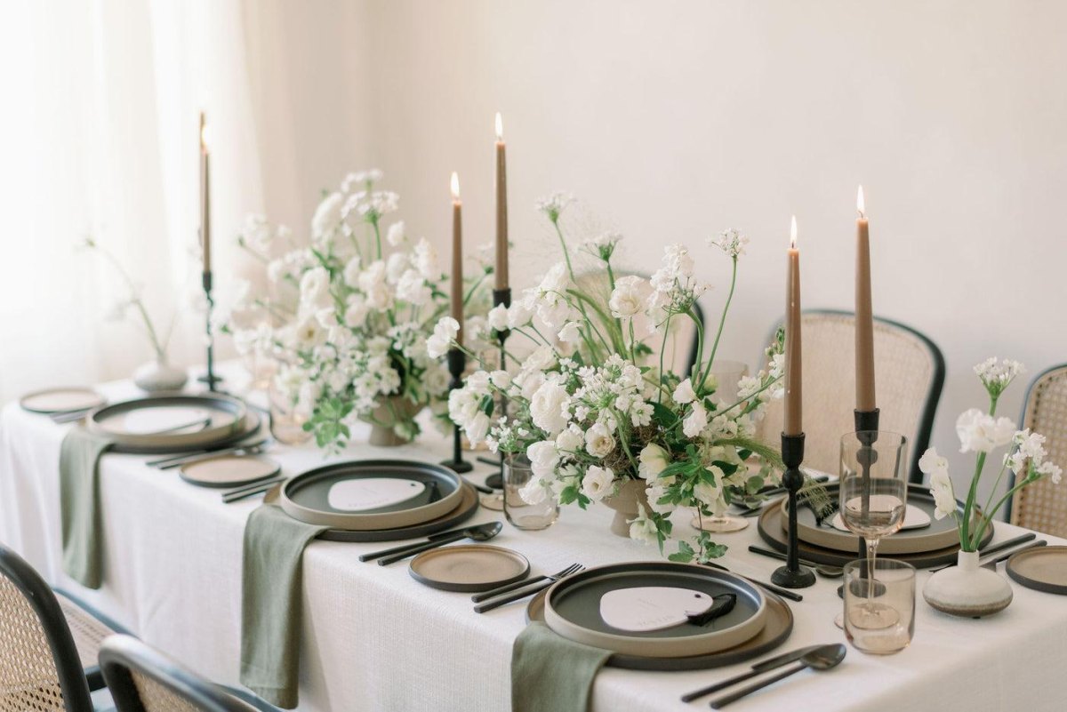
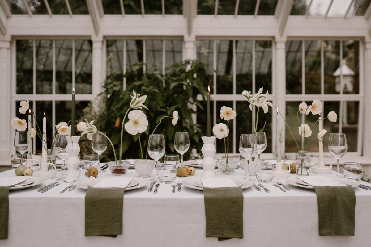
I keep coming back to sage and ivory because it feels elegant without trying too hard. This botanical wedding palette works beautifully with greenery, cream flowers, and natural textures.
I would use ivory as the foundation and layer different greens rather than repeating one shade everywhere. That small change keeps the design from looking flat.
My styling tip
Add champagne accents or warm wood details if the venue feels too cool.
Champagne and Blush Pink Wedding Palette

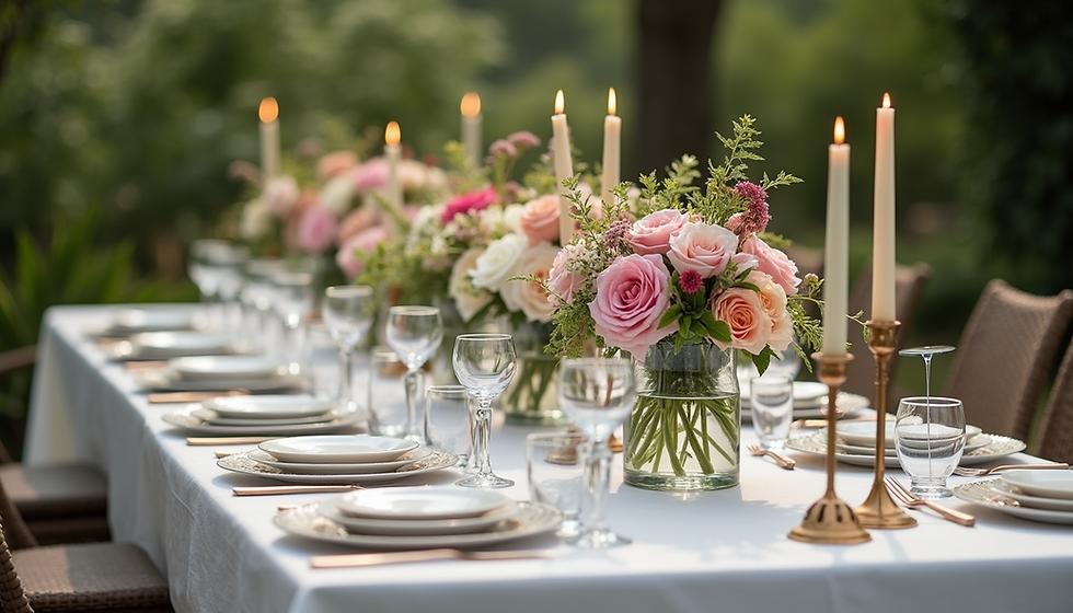
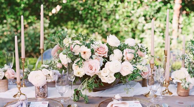
Champagne and blush is one of those combinations that keeps surviving trend cycles because it photographs beautifully. The soft romantic pairing works for gardens, estates, and candlelit receptions.
I like using blush as a gentle accent instead of letting it dominate. Champagne linens, ivory flowers, and subtle metallic touches keep the look grown-up.
Black and White Minimalist Wedding Palette

Black and white is the palette I recommend when the architecture should do some of the talking. It creates a modern minimalist wedding look that feels sharp and intentional.
The trick is texture. I would mix matte fabrics, glossy stationery, candles, and floral shapes so the room does not feel like a blank photograph.
Why it works
- Feels timeless in photos.
- Pairs well with formal venues.
Watch for
- Too little texture can feel cold.
Terracotta and Earthy Neutral Wedding Palette

Terracotta is a favorite when couples want warmth without going overly traditional. I love this earth-inspired wedding palette with sand, cream, dried florals, and natural materials.
It is especially convincing outdoors because the colors already exist in landscapes, wood, and sunset light.
Palette notes
- Terracotta adds warmth.
- Neutral tones keep it balanced.
Dusty Blue and Silver Wedding Palette

Dusty blue and silver gives a wedding a calm, airy feeling. I see it working especially well for couples who want a soft modern color combination without using traditional pastels.
Silver works best as a detail rather than the main event. Think candle holders, stationery accents, and subtle tableware.
Emerald Green and Gold Wedding Palette

Emerald and gold is where I would go for a more dramatic reception. The jewel tone wedding palette feels rich, especially with velvet, candles, and evening lighting.
I would avoid adding too many competing colors here. Emerald already carries plenty of personality.
| Element | Suggestion |
|---|---|
| Flowers | White blooms and greenery |
| Metallic | Brushed gold accents |
Lavender and Mauve Wedding Palette

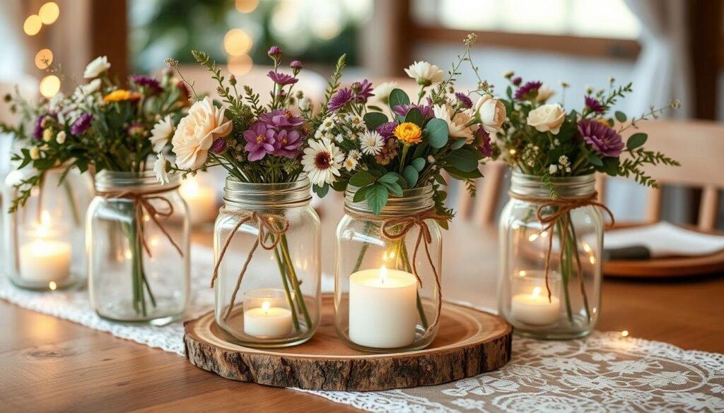
Lavender and mauve feel romantic but less expected than classic pink. I like this soft purple wedding theme because it works with gardens, vintage spaces, and contemporary venues.
The best versions use multiple tones instead of one purple shade repeated everywhere.
A small detail
Pair lavender with cream or greenery to keep it sophisticated.
Navy Blue and Warm Beige Wedding Palette

Navy and beige is one of the safest modern choices when you want elegance that does not feel overly formal. The balanced navy palette gives structure while warm beige prevents it from becoming too serious.
I especially like it for evening weddings, coastal venues, and celebrations with classic tailoring.
Peach and Coral Wedding Palette

Peach and coral bring energy without becoming overwhelming. I would choose this sunny wedding color palette for outdoor celebrations, summer receptions, or couples who want something cheerful.
Adding ivory or soft beige gives the brighter tones somewhere to rest.
Best pairing idea
Combine peach flowers with coral accents and neutral fabrics for a balanced look.
Burgundy and Rose Gold Wedding Palette

Burgundy and rose gold creates the kind of atmosphere that feels made for candlelight. The moody romantic palette works beautifully for fall and winter celebrations.
I would soften burgundy with blush or cream so the room feels inviting instead of heavy.
2-3
supporting shades are usually enough to keep a rich palette balanced
Modern Monochrome Gray Wedding Palette

A monochrome gray wedding can be incredibly sophisticated when the shades have variation. I prefer a layered gray design with charcoal, silver, stone, and soft fabrics.
The mistake is choosing one flat gray everywhere. Contrast is what makes a neutral palette feel intentional.
A good neutral palette is not empty; it is built on texture, light, and contrast.
Naomi Vance
More Pinterest Visuals