I have always liked wedding colors that can handle real life, not just a perfect inspiration photo. Blue is one of those rare choices that can feel coastal, formal, soft, dramatic, or botanical depending on what you pair with it. I pulled together these blue wedding palette ideas with the details I would actually consider when styling a venue.
I focus on how colors work across tables, flowers, stationery, and clothing because a palette has to survive the whole day, not just the first photo. My favorite combinations usually give blue room to breathe with a thoughtful neutral.
Navy Blue and White Coastal Wedding Palette
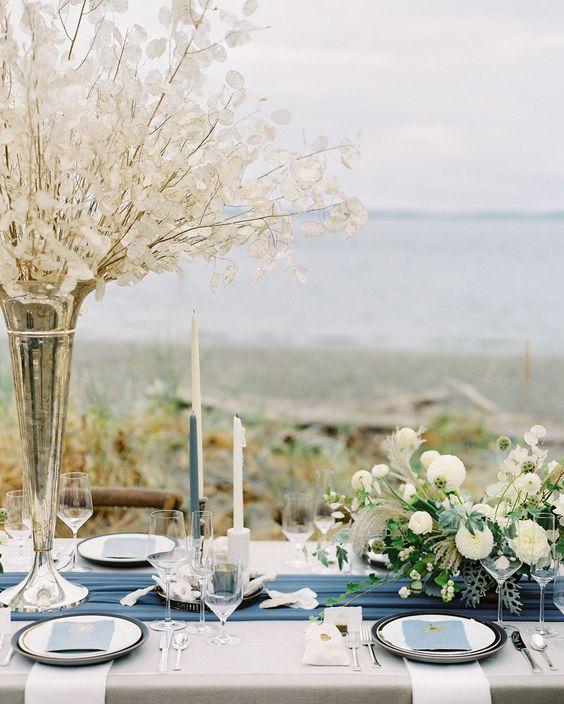
Navy and white is the combination I return to when someone wants a wedding that feels polished without feeling overdone. The contrast creates a timeless coastal look, and it works beautifully with seaside venues, sailcloth textures, and simple florals.
Styling tip
I would use navy as the anchor and let white handle the larger areas, because too much dark color can make a bright venue feel heavier.
For me, the easiest win is navy linens, white flowers, and small touches of ocean-inspired blue in paper goods.
Dusty Blue and Champagne Elegant Wedding Palette

Dusty blue and champagne has the soft elegance many couples want without becoming too sweet. I like this pairing because champagne adds warmth while dusty blue keeps the room calm and airy.
| Color | Best use |
|---|---|
| Dusty blue | Dresses, linens, floral accents |
| Champagne | Metallic details, candles, stationery |
I would avoid making every detail the same shade. A little contrast keeps the elegant palette balanced.
Royal Blue and Gold Luxury Wedding Palette

Royal blue and gold is where I go when the goal is a more dramatic celebration. The deep blue gives structure, while gold creates that formal luxury feeling people often look for in ballroom weddings.
My styling note
I would keep gold as an accent instead of letting it take over. Metallics work best when they highlight the details rather than compete with them.
This palette works especially well with velvet textures, candlelight, and classic stationery.
Blue and Blush Romantic Wedding Palette

Blue and blush is one of the easiest romantic combinations to personalize. The cool side of blue paired with a warm pink creates a soft romantic contrast that suits flowers, bridesmaid dresses, and delicate details.
- Use blush flowers to soften blue textiles.
- Add ivory to keep the palette from feeling too busy.
- Repeat both colors in small details.
I like this option because it photographs gently while still having enough personality.
Sapphire Blue and Emerald Green Jewel-Tone Wedding Palette

When I think of jewel tones, I think of depth. Sapphire blue and emerald green create a rich layered palette that feels especially fitting for evening celebrations. Jewel-tone weddings often pair saturated colors with metallic accents for a luxe effect.
Works well for
- Evening receptions
- Candlelit spaces
- Formal floral designs
Watch out for
- Overloading the room with dark shades
- Losing contrast in small venues
I would bring in ivory or metallic accents to give these colors breathing room.
Ice Blue and Silver Winter Wedding Palette

Ice blue and silver gives me that crisp winter feeling without needing holiday decorations. The combination creates a frosted elegant atmosphere with cool textures and reflective details.
- Layer. Add silver glassware, blue textiles, and white flowers.
- Warm. Include candles or soft lighting to avoid a cold look.
This is one of those palettes where texture matters as much as color.
Teal Blue and Coral Tropical Wedding Palette

Teal blue and coral brings energy into a wedding design. I like it for couples who want a bright tropical palette that feels relaxed rather than overly formal.
- Teal: Use for ocean-inspired foundations and statement pieces.
- Coral: Add warmth through flowers and accents.
I would keep natural materials nearby, such as wood, greenery, or woven textures, to make the colors feel grounded.
Baby Blue and Ivory Soft Wedding Palette

Baby blue and ivory is a gentle choice that feels classic without disappearing. The ivory creates a soft neutral foundation, while baby blue adds personality in subtle ways.
Why I like this pairing
- It works across seasons.
- It suits romantic and traditional styles.
- It is easy to repeat through decor.
I would use this palette when the goal is calm, graceful, and easy-to-coordinate wedding details.
Midnight Blue and Burgundy Dramatic Wedding Palette

Midnight blue and burgundy is for couples who want mood and contrast. The darker shades create a dramatic wedding atmosphere that works beautifully with autumn textures and evening lighting.
Common mistake
Do not fill every surface with dark colors. Add lighter linens, candles, or flowers so the palette still feels inviting.
I would use this combination sparingly and let the deepest colors act like punctuation marks.
Blue Lavender and Mauve Garden Wedding Palette

Blue lavender and mauve creates a garden-inspired palette with a softer edge. I like how these shades blend into floral settings while still creating a romantic layered look.
This is a palette where I would let nature do some of the decorating and keep the added details simple.
Classic Blue and Green Botanical Wedding Palette

Blue and green is one of the most natural pairings because it already exists outdoors. I would use it for a botanical wedding theme with greenery, blue florals, and organic textures.
- Mix different leaf shapes for texture.
- Use blue as an accent rather than a flat background.
- Add natural materials for warmth.
The result feels fresh, timeless, and much easier to personalize than a strict two-color rule.
More Pinterest Visuals