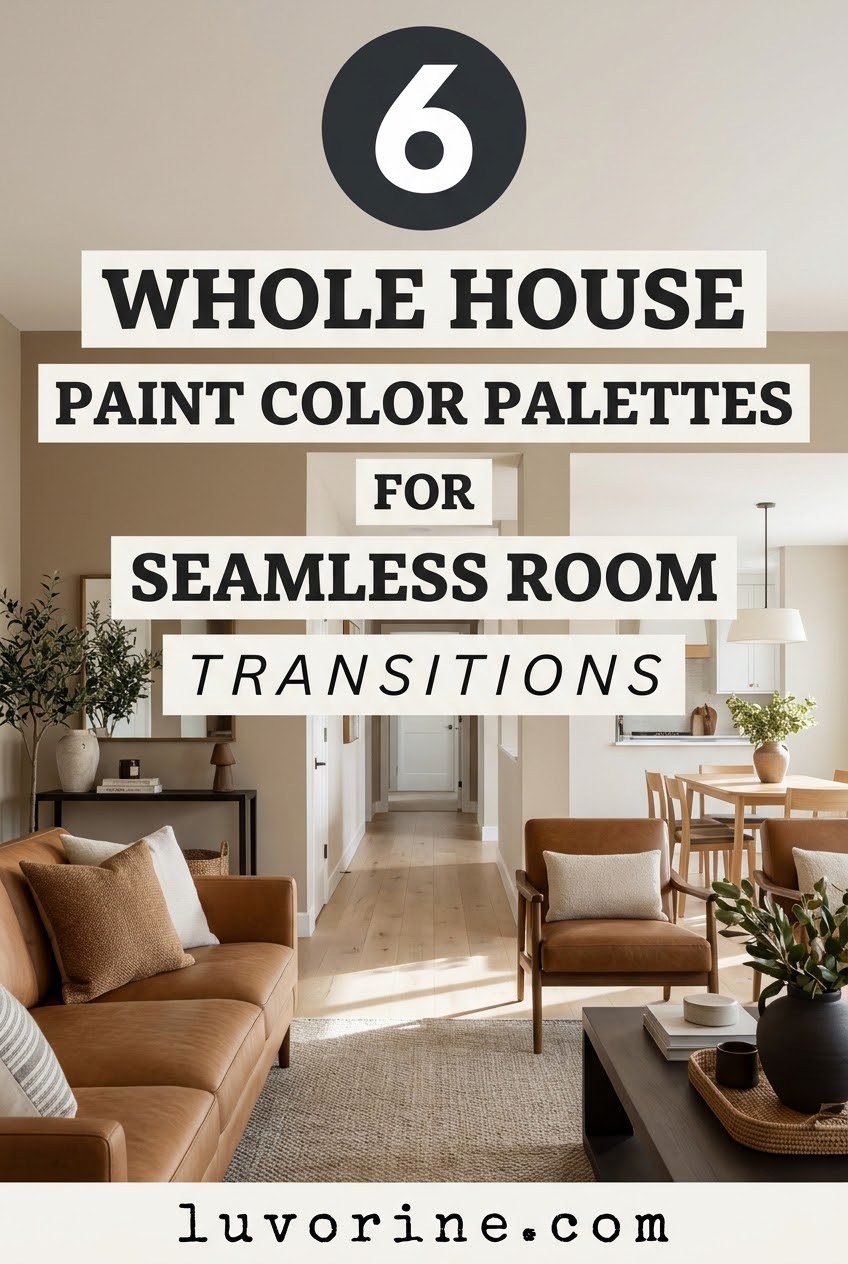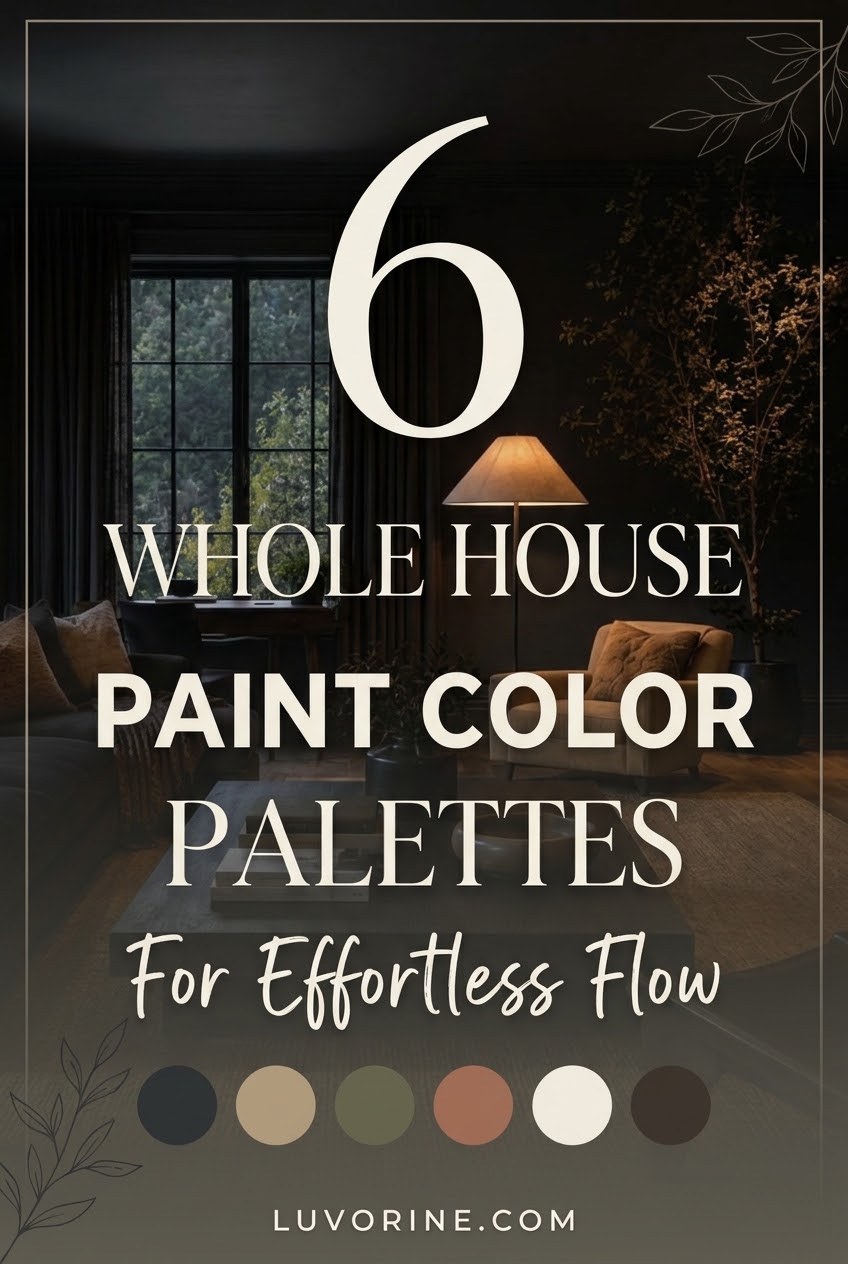
Have you ever walked from your living room into the hallway and felt like you just crossed into an entirely different universe? Picking a single paint color is hard enough, but making an entire house feel connected without painting every single wall the exact same boring beige is a genuine test of patience.
You do not need an interior design degree to fix a choppy floor plan. By sticking to a curated group of shades that actually like each other, you can create a home that flows effortlessly from the front door to the back patio.
Whole-House Color Palettes at a Glance
- Stick to 5 to 7 total colors across your entire home for a cohesive feel.
- Use the 60-30-10 rule to balance your main walls, secondary rooms, and bold accents.
- Match your paint undertones (warm or cool) so adjacent rooms never clash.
The Secret Formula Behind Every Designer Home
Before we dive into the pretty swatches, how do the pros actually pull this off? It all comes down to controlling your sightlines and following a simple ratio.
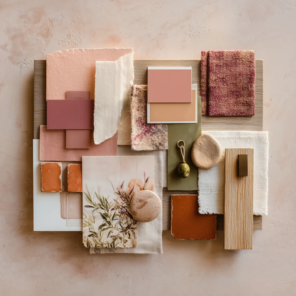
When you stand in your living room, every other room you can see needs to share the same visual language. Designers rely on the 60-30-10 rule to keep things balanced without feeling repetitive.
60-30-10
The golden ratio of 60% dominant neutral, 30% secondary shades, and 10% bold accents.
Your 60% color is your workhorse neutral for hallways, entryways, and open-concept living areas. The 30% goes to secondary spaces like bedrooms and offices, while that final 10% is reserved for dramatic powder rooms, kitchen islands, or built-in cabinetry.
1. Warm Organic Modern
Do you crave a home that feels like a deep exhale the second you walk through the door? Cold, clinical grays are officially in the rearview mirror, replaced by creamy whites, soft sage greens, and rich walnut undertones.
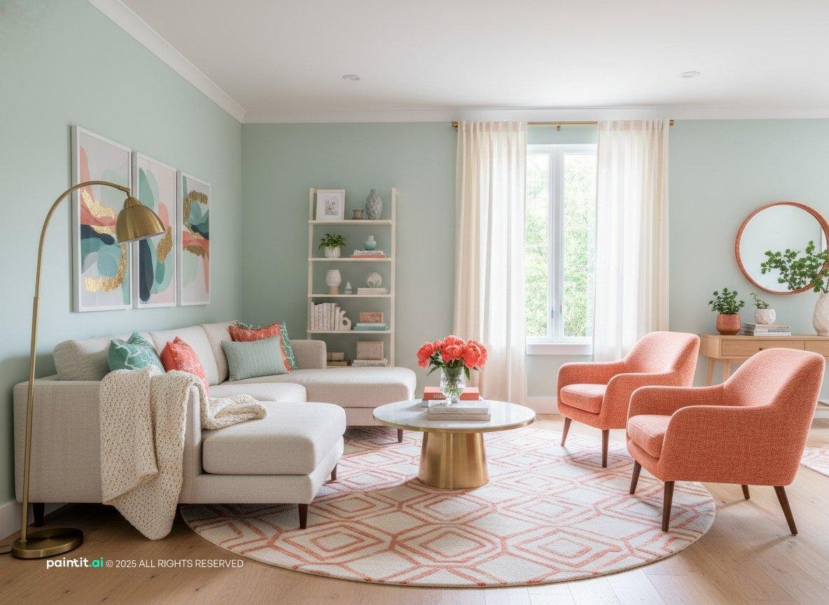
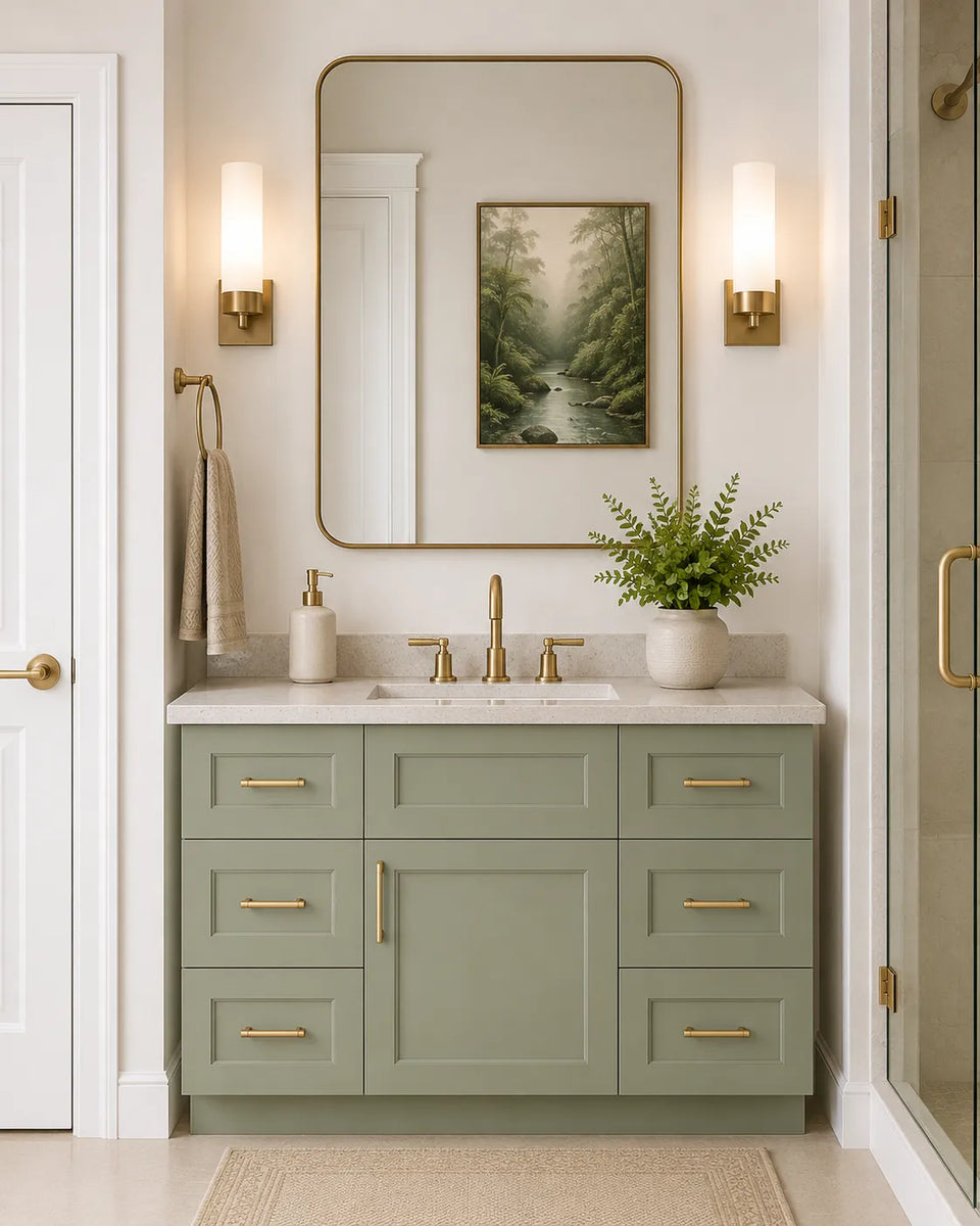
This palette is the ultimate crowd-pleaser because it brings the outdoors inside without feeling like a literal log cabin. Use an alabaster or creamy off-white for your main living areas, then wrap your bedrooms in a dusty sage green.
- 60% Main Connector: Creamy Alabaster or Soft Ivory
- 30% Secondary Spaces: Muted Sage Green and Warm Oatmeal
- 10% Bold Accents: Deep Espresso Brown or Terracotta Clay
- Trim & Ceilings: Crisp Warm White
Where should you put that deep espresso accent? Try it on your interior doors or a home office accent wall to ground all those airy neutrals.
2. Effortless Coastal Calm
Forget kitschy anchor decor and neon turquoise walls. Modern coastal design is all about capturing the quiet, breezy vibe of sand dunes, morning fog, and washed linen.
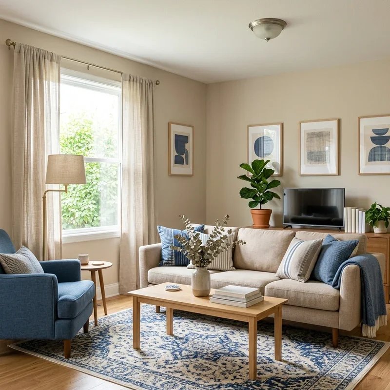
If your home gets plenty of natural morning light, soft blues and sandy beiges will make your rooms feel twice as big. Isn't it nice when your bedroom feels like a boutique beach hotel?
- 60% Main Connector: Crisp Linen White or Pale Sand
- 30% Secondary Spaces: Misty Blue-Gray and Sea Salt Green
- 10% Bold Accents: Deep Navy Blue or Charcoal Slate
- Trim & Ceilings: Pure Chantilly White
Keep your open kitchen and living room in pale sand, then let the bedrooms drift into misty blue-gray. A deep navy on the laundry room cabinets or dining room wainscoting keeps the palette sophisticated and anchored.
3. Moody Modern Drama
Who says your main palette has to be bright and bubbly? If you love cozy rainy days, velvet textures, and vintage leather sofas, a moody neutral scheme is calling your name.
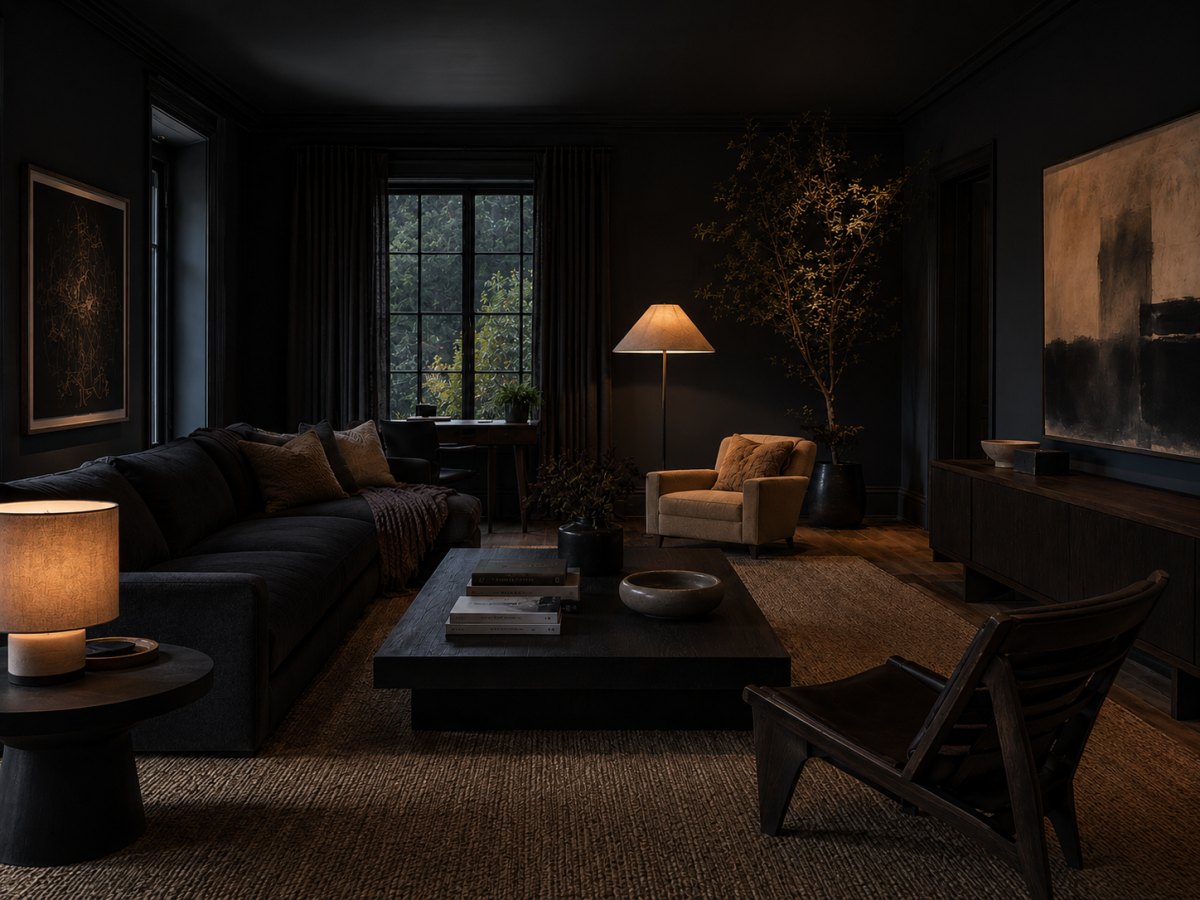
The trick to pulling off dark colors across a whole house is balancing them with warm mid-tones so your hallway doesn't feel like a cave. Pair mushroom taupe connectors with dramatic charcoal and plum bedrooms.
- 60% Main Connector: Warm Mushroom Taupe or Soft Greige
- 30% Secondary Spaces: Smoked Charcoal and Warm Pewter
- 10% Bold Accents: Deep Aubergine Plum or Cognac Rust
- Trim & Ceilings: Soft Putty White (skip stark white here!)
Going Dark & Moody
- Creates instant coziness and high-end drama in enclosed rooms
- Hides scuffs, shadows, and awkward architectural quirks
Keeping It Light & Airy
- Can make small, windowless hallways feel tight without good lighting
- Requires extra coats of primer if you ever decide to paint over it
4. Sun-Baked Desert Chic
Want your home to feel like perpetual golden hour? Inspired by Southwestern landscapes, this warm earthy palette wraps every room in sun-baked clay, sienna, and creamy plaster tones.
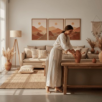
Because all of these shades share a warm, sunny undertone, you can transition from a creamy stucco living room into a terracotta dining room without a single awkward clash.
- 60% Main Connector: Creamy Stucco White or Warm Canvas
- 30% Secondary Spaces: Muted Clay and Sandy Ochre
- 10% Bold Accents: Burnt Sienna or Cactus Olive Green
- Trim & Ceilings: Warm Creamy White
Add lots of indoor plants and woven textures like jute or rattan. The natural greenery pops effortlessly against terracotta and clay walls.
5. Nordic Serene Greige
What if you genuinely hate clutter and just want a clean, gallery-like backdrop for your life? Enter the Nordic serene palette, where cool and warm tones meet in the ultimate peaceful truce.
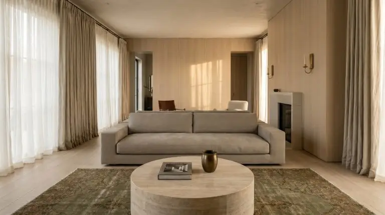
Greige—the magical lovechild of gray and beige—adapts like a chameleon as the sunlight shifts from morning to evening. It looks crisp in bright rooms and cozy in dim corners.
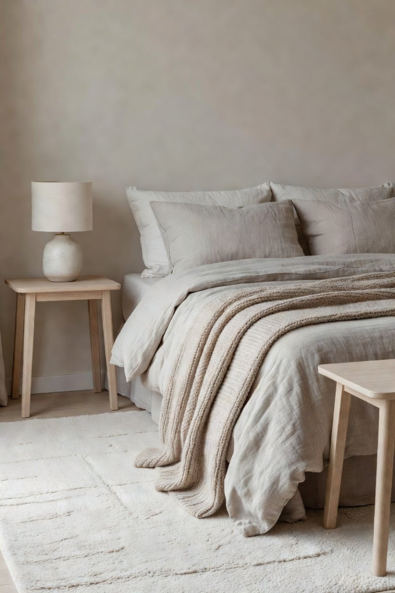
- 60% Main Connector: Balanced Pale Greige or Chalky White
- 30% Secondary Spaces: Warm Stone Gray and Pale Oak Tan
- 10% Bold Accents: Matte Black or Deep Forest Slate
- Trim & Ceilings: Matching Wall Color in Satin Sheen
Pro tip: Paint your baseboards and window trim the exact same greige as your walls, just one sheen glossier. This designer trick erases visual choppiness and makes low ceilings look noticeably taller.
6. Historic Heritage Romance
Do you live in an older home with crown molding, wainscoting, or quirky nooks—or do you just wish you did? This Bridgerton-meets-modern palette leans into dusty, muted jewel tones that feel timeless and storied.
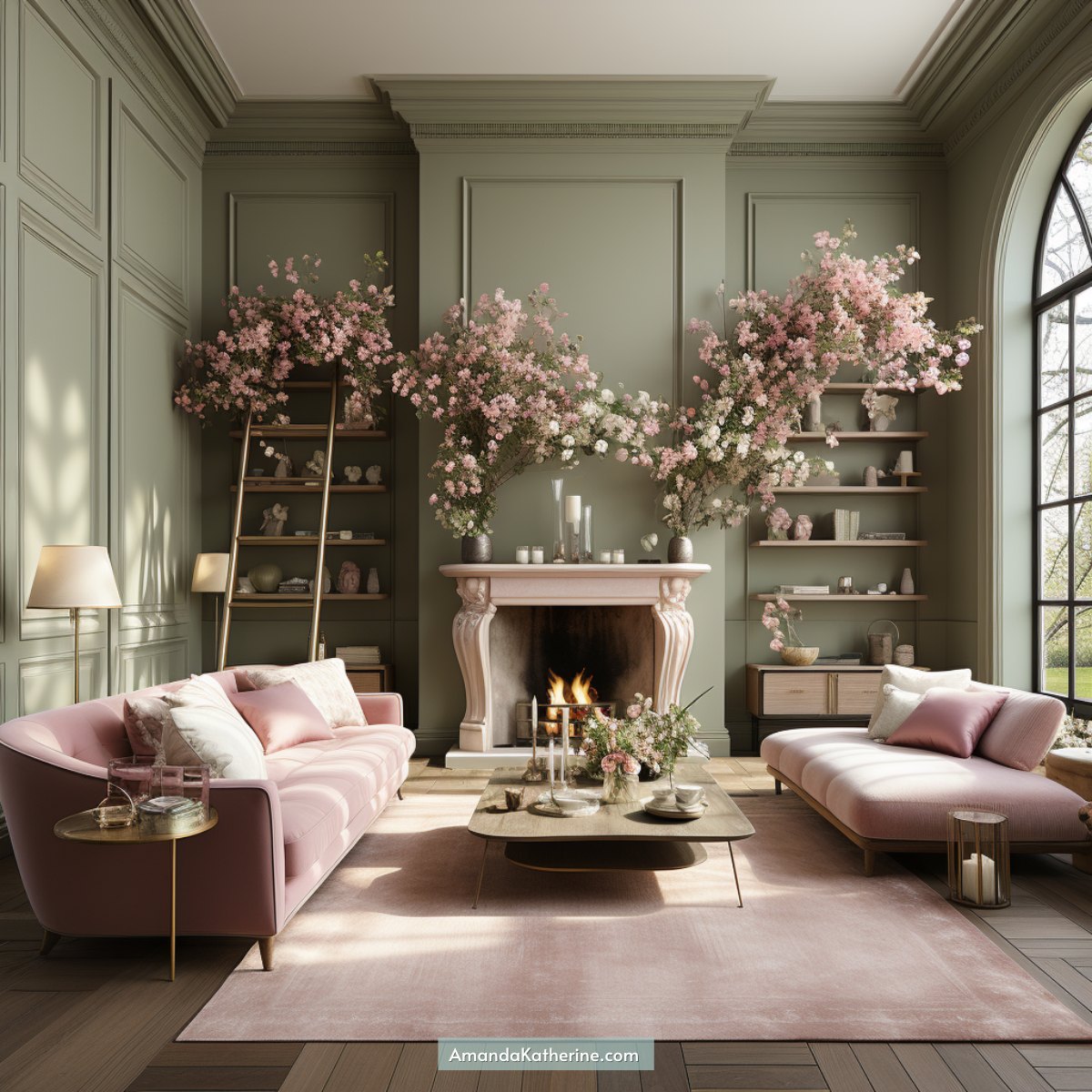
The secret here is choosing muddy or muted colors—shades mixed with a drop of gray or brown so they feel sophisticated rather than sugary sweet. How gorgeous would an olive green dining room look peeking through a creamy hallway?
- 60% Main Connector: Antique Parchment or Soft Putty Gray
- 30% Secondary Spaces: Light Olive Green and Dusty Mauve-Pink
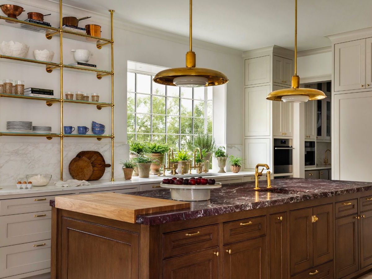
- 10% Bold Accents: Burgundy Claret or Antique Brass Ochre
- Trim & Ceilings: Soft Heritage Cream
Save that dusty mauve or burgundy claret for an enclosed space like a powder bath or guest bedroom. When guests open the door, it feels like discovering a hidden jewel box.
Fixed Elements to Check Before Buying Paint
- Flooring undertones (red oak, cool gray tile, or honey hardwood)
- Kitchen countertops and backsplash veining
- Metal hardware finishes (warm brass vs. cool brushed nickel)
- Natural light direction in each room (north-facing vs. south-facing)
How to Transition Colors Without Awkward Lines
Even with the best palette on earth, figuring out where one paint color stops and the next one starts in an open floor plan can make your head spin. Never stop a bold paint color on an outside corner where two walls meet—it always looks unfinished.
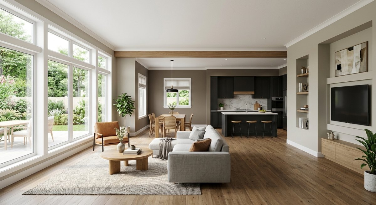
Instead, use natural architectural breaks like door frames, archways, or cased openings to switch shades. If your living room, kitchen, and hallway share one giant continuous wall, keep that entire wall in your 60% connector neutral and add color through cabinets, islands, or adjacent enclosed rooms.
How to Test Your Whole-House Palette
- Tape large peel-and-stick paint swatches at eye level in every connecting room.
- Group all 5 to 7 swatches together on one table to verify their undertones don't clash.
- Check the colors on your walls at 9 AM, 2 PM, and 8 PM under your actual light bulbs.
- Walk through your main hallway and check the sightlines into every open doorway.
So, which of these six palettes matches your personality best—are you playing it cool with Nordic greiges, or diving headfirst into moody drama? Grab a few sample pots this weekend, trust your sightlines, and watch your whole house finally come together.

More Pinterest Visuals