Are you tired of staring at that giant, soul-crushing blank wall behind your sofa? We all went through that sad beige minimalist phase, and honestly, it is time to stage a full-blown color intervention.
Bringing vibrant energy into your living space does not require a design degree or a trust fund. Which of these seven colorful gallery wall ideas is about to take over your weekend plans?
1. The Dopamine Maximalist Mashup
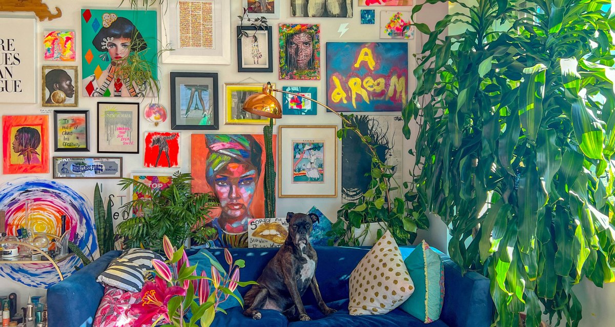
Why pick just one color scheme when you can invite the entire crayon box to the party? Dopamine decor is all about surrounding yourself with unapologetic, joy-sparking shades like electric cobalt, tangerine, and hot magenta.
The secret to keeping this look curated rather than chaotic is spacing. Leave a consistent two-inch gap between every frame so your eyeballs have a place to rest between all those loud prints.
Why You Will Love It
- Instant mood booster every time you walk into the room
- Super easy to add new quirky prints over time without worrying about strict rules
What To Watch Out For
- Can make a tiny room feel visually crowded if you skip negative space
- Takes serious restraint not to buy every weird poster you see online
Want to mix graphic typography with abstract paint splatters and vintage travel posters? Go right ahead, because confidence is the only rule that actually matters here.
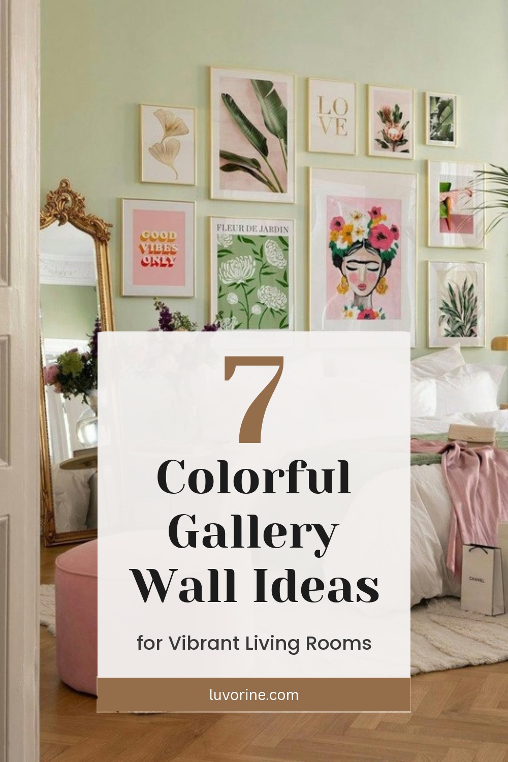
2. The Botanical Pink and Green Oasis
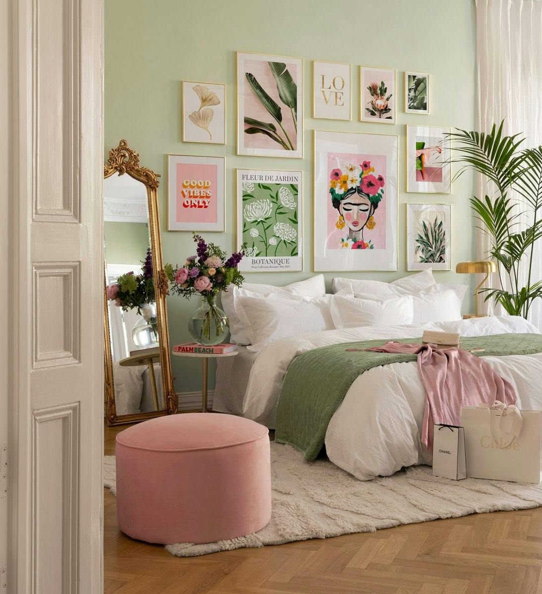
Have you ever noticed how nature never clashes with itself? Pairing leafy emerald greens with blush pinks and warm terracotta creates an instant indoor garden vibe—minus the pressure of keeping actual houseplants alive.
Stick to two or three core shades and weave in slim gold or warm oak frames. Does it get any fresher than a wall that feels like a permanent spring morning?
The Two-Tone Rule
Keep 70 percent of your prints anchored in your two main colors (like sage green and dusty rose) and use the remaining 30 percent for creamy neutrals so the wall feels airy rather than overwhelming.
3. The Moody Color-Drenched Backdrop
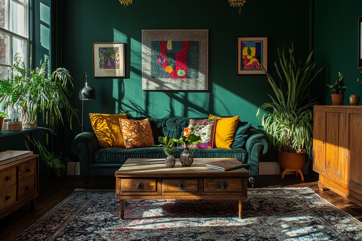
Who said your gallery wall has to sit on top of plain white drywall? Painting the wall itself a rich jewel tone—like deep emerald, peacock blue, or plum—makes bright artwork pop off the surface like neon on velvet.
When the background does half the heavy lifting, you actually need fewer frames to make a massive statement. Five to seven oversized colorful pieces on a dark wall look effortlessly expensive.
A white wall asks your art to whisper, but a jewel-toned wall hands your favorite colors a megaphone.
Luvorine.com editorial note
4. The Thrifted Gold Frame Treasure Hunt
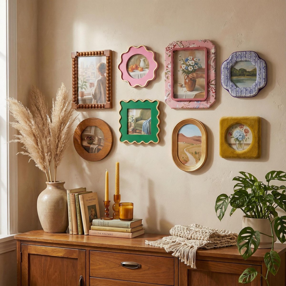
Ready to turn your Saturday flea market runs into a design flex? Mixing ornate, chunky vintage gold frames with shockingly bright modern illustrations creates that coveted cool art collector aesthetic.
You can pair a centuries-old style oil portrait with a neon pink typography print and somehow they become best friends. Because all the frames share a warm metallic finish, the wild color jumps inside the glass still look completely intentional.
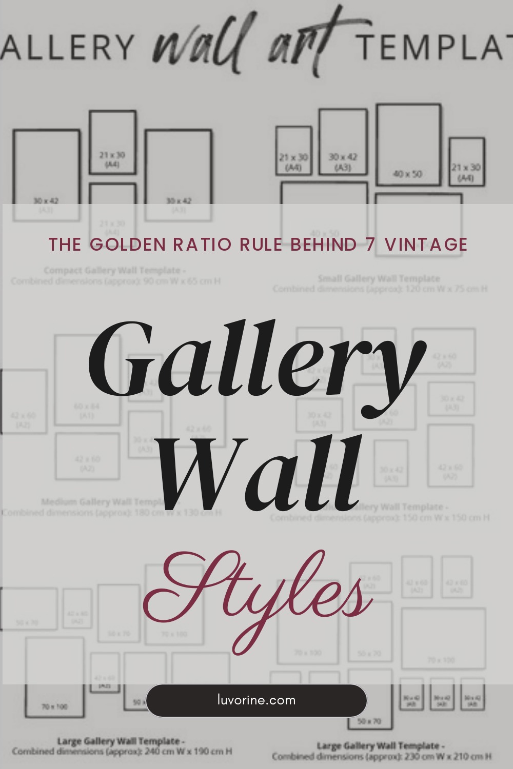
The Golden Ratio for Vintage Walls
- Anchor Piece: One oversized frame taking up 30% to 40% of the visual weight
- Frame Finish: 80% brushed brass or antique gold, 20% dark wood accents
- Ideal Gap: 2 to 2.5 inches between outer frame edges
- Center Height: 57 to 60 inches from the floor for museum-level viewing
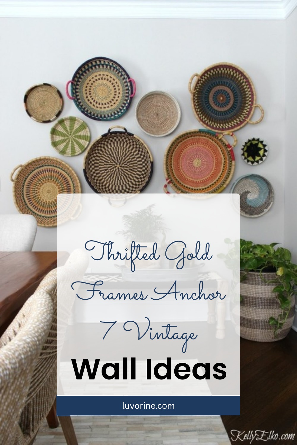
5. Beyond the Frame: 3D Baskets and Plates
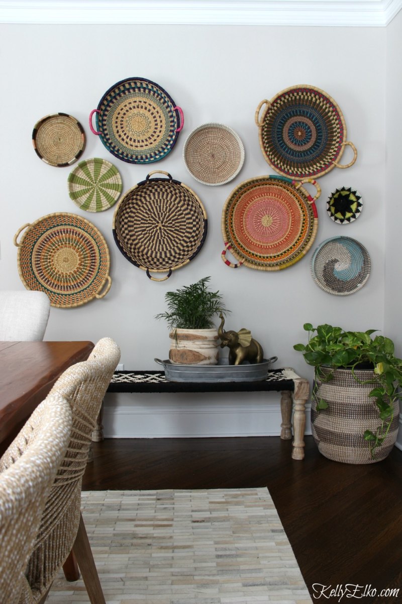
Are rectangular picture frames starting to bore you to tears? Break up the flat geometry by throwing woven colorful baskets, painted vintage ceramic plates, or sculptural wall sconces right into the mix.
Tactile walls are huge right now because they add real shadows and physical depth. Plus, round plates and woven textures soften all those sharp 90-degree frame corners in seconds.
6. The Pastel Geometric Breath of Fresh Air
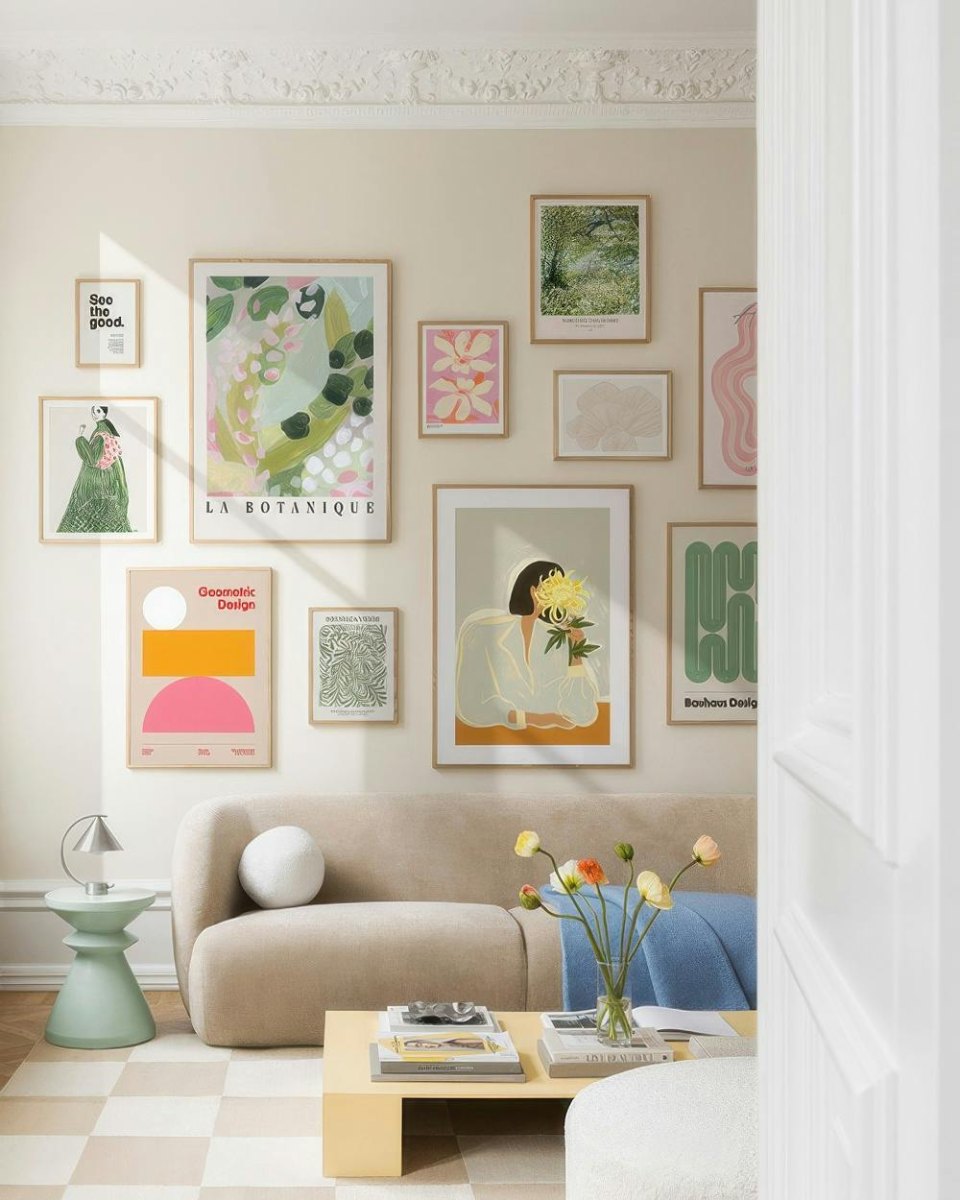
Love color, but terrified that neon shades will give you a headache by Tuesday? Swap the high-voltage primaries for buttery yellows, lilac, pistachio green, and soft sky blue.
Pastel gallery walls bring all the personality of a colorful display while keeping the room calm enough for a Sunday afternoon nap. Pair them with thin light-wood frames to keep the whole arrangement looking weightless.
Pre-Hanging Reality Check
- Measure your sofa so the gallery spans 60% to 75% of its width
- Cut a 2.5-inch cardboard square to use as an instant spacing tool between frames
- Check where afternoon sunlight hits and put UV-protective glass on delicate prints
- Grab painter's tape and kraft paper before touching a single hammer
7. Electric Pop Art and Neon Statements
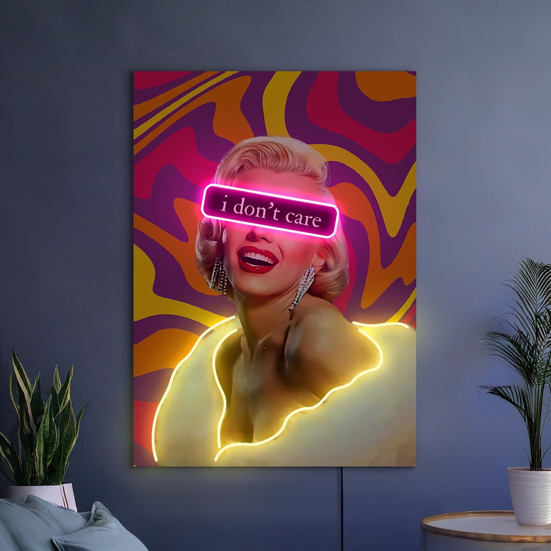
Sometimes a room does not need a polite conversation piece—it needs a visual wake-up call. Anchoring your wall with bold pop art, comic-inspired graphics, or even an LED neon sign turns a dull corner into an instant selfie backdrop.
Surround one rebellious, high-contrast centerpiece with four or five smaller graphic prints. What better way to tell your guests that you do not take life too seriously?
How to Hang Your Colorful Wall Without Losing Your Mind
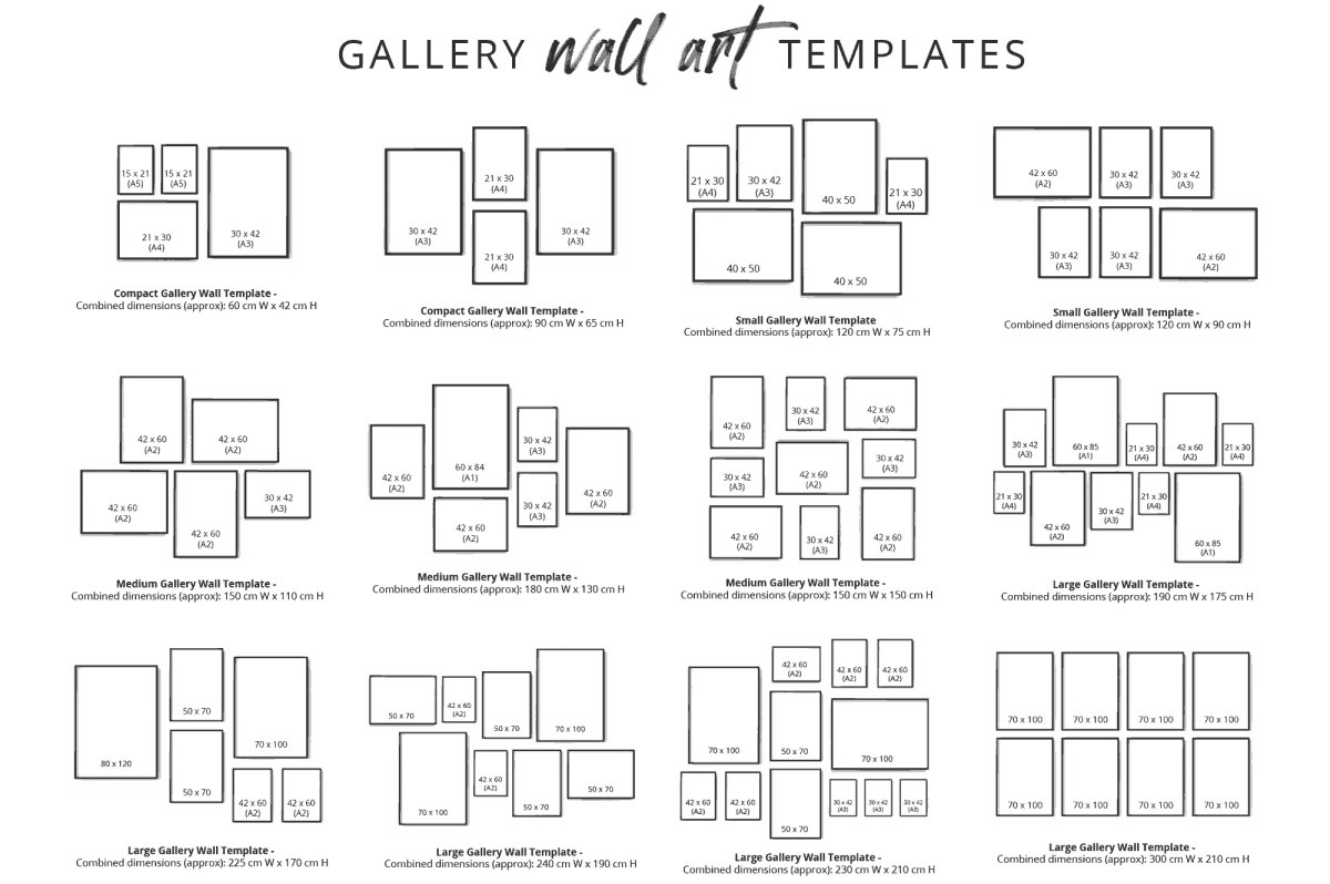
Staring at a pile of frames on the carpet and feeling sudden paralysis? Putting holes in drywall feels scary, but pros never actually eyeball a layout with a hammer in hand.
Use the floor-and-paper trick first so you can swap colors around until the balance clicks. Ready to hang everything up in under an hour without turning your drywall into Swiss cheese?
The Zero-Regret Hanging Method
- Lay all your framed art on the floor and shuffle them until the bright colors are evenly distributed instead of clumped on one side.
- Trace each frame onto butcher paper, cut out the shapes, and mark exactly where the hanging nail sits on the back.
- Tape the paper cutouts to your wall, step back ten feet to do a quick squint test, and adjust any awkward gaps.
- Hammer your nails directly through the marks on the paper, rip the paper off the wall, and hang your frames.
So, are you going full dopamine maximalist, or is the moody jewel-toned wall calling your name? Grab that painter's tape and start claiming your wall space today!
How many frames do I actually need for a modern colorful gallery wall?
Fewer than you think! Current interior trends favor 5 to 7 larger, curated pieces rather than 15 tiny frames, giving your wall a cleaner, more high-end look.
How do I keep different colorful art prints from clashing?
Use a unifying thread—either keep all the frames the exact same finish (like matte black, oak, or gold) or limit your artwork to 2 or 3 repeating accent colors across every print.
Can I build a colorful gallery wall in a rental without losing my security deposit?
Absolutely! Use lightweight frames with heavy-duty adhesive picture hanging strips, or lean colorful overlapping frames on a narrow floating picture ledge that only requires two small screws.
More Pinterest Visuals